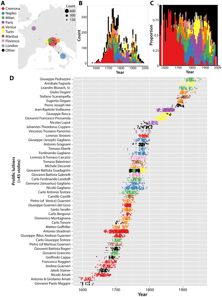
Figure 3. The historical and geographic context of luthiers and their violins.
A) Geography of violin production in Europe. Overlaid on a map, circle color and location indicates cities of production and size is proportional to the violin output represented in this dataset. B) Stacked histrogram of violin production by year. Colors indicate city of manufacture. C) Same data as in B), but scaled to show the proportional output of each city by year. D) Output of prolific luthiers (with>45 violins in the dataset) over historical time. Points correspond to violins and the year of production, colored by the city of production. Luthiers are organized temporally, by the mean year of their violins represented in the dataset. Cremona, red; Naples, blue; Milan, green; Paris, purple; Venice, orange; Turin, yellow; Mantua, brown; Florence, pink; London, grey; other cities, black.

