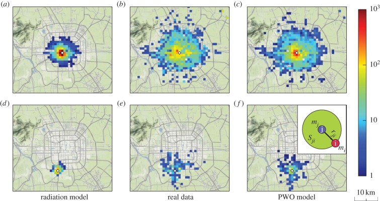
Figure 1.
Human mobility range at city scale. (a–c) Spatial distributions of destination selections for travelling from a downtown location (displayed as a diamond-shaped dot) in Beijing. (d–f) Spatial distributions of travel from a suburban location. From left to right, the panels correspond to the results generated by the radiation mode, the observed data and the results generated by the PWO model. The colour bar represents the number of travellers from the origin to a destination. The inset offers definitions of variables used in the model, in which the purple circle (location i) denotes an origin with population mi, the blue circle (location j) stands for a destination with population mj and Sji represents the total population in a circular area of radius rji centred at location j (including mi and mj).

