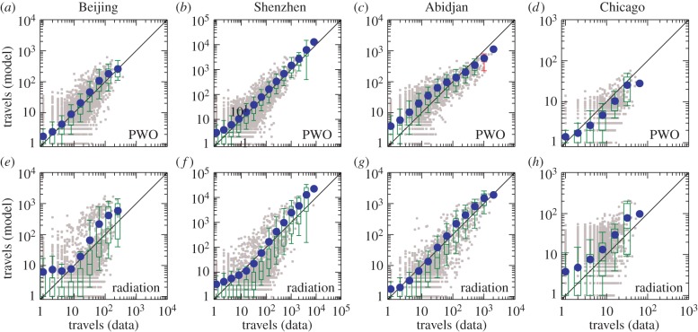
Figure 4.
Comparing the observed fluxes with the predicted fluxes in four cities. (a–d) Travel fluxes predicted by the PWO model. (e–h) Travel fluxes predicted by the radiation model. The grey points are scatter plot for each pair of locations. The blue points represent the average number of predicted travels in different bins. The boxplots, obtained via standard statistical methods [30], represent the distribution of the number of predicted travels in different bins of the number of observed travels. A box is marked in green if the line y = x lies between 10% and 91% in that bin and in red otherwise.

