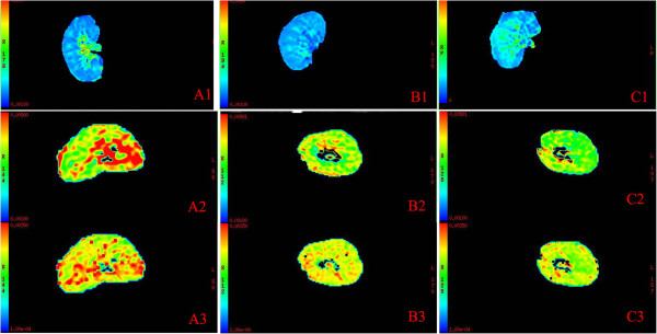
Figure 1.

The representative R2* maps and ADC maps of renal allografts in AR group, ATN group and control group. A, the representative R2* map (A1) and ADC maps (A2, ADC map of low b values; A3, ADC map of high b values) of normal control allograft; B, the representative R2* map (B1) and ADC maps (B2, ADC map of low b values; B3, ADC map of high b values) of AR allograft; C, the representative R2* map (C1) and ADC maps (C2, ADC map of low b values; C3, ADC map of high b values) of ATN allograft. In R2* maps, the coronal section of the kidney is shown. The change of color from blue to green, orange, and then red represents the change of R2* value from lower to higher. There were more blue regions in the medulla of AR allograft (B1) and more green regions in the medulla of ATN allograft (C1), compared with normal control allograft (A1). In ADC maps, the transverse section of the kidney is shown. The change of color from green to orange, and then red represents the change of ADC value from lower to higher. There were less red regions and more green regions in AR allograft (B2, B3) and ATN allograft (C2, C3) compared with normal control allograft (A2, A3), regardless of low or high b values.
