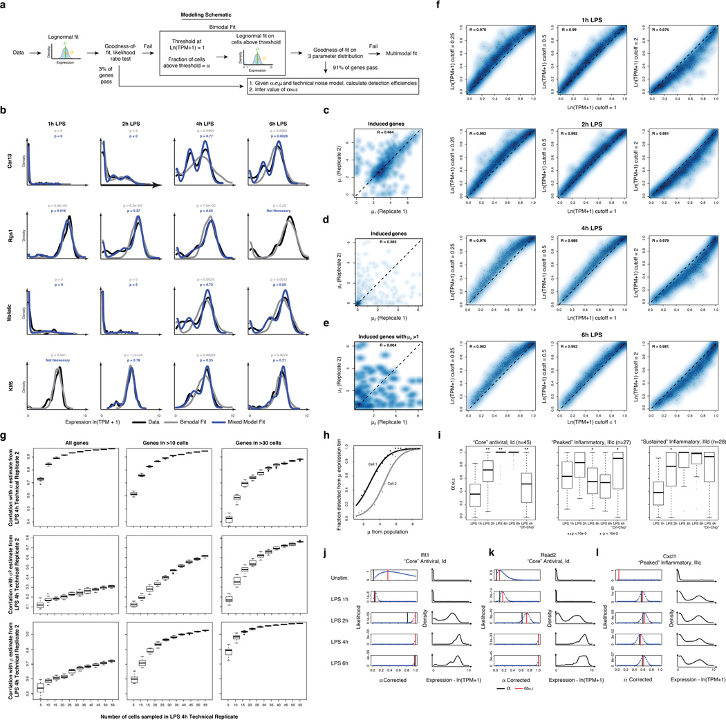
Extended Figure 7. Fitting gene expression distributions.
(a) Flow chart of model fitting. Shown are the key steps in fitting the 3-parameter model. (b) Examples of cases where fitting a multimodal distribution is required. Single-cell expression distributions for (top to bottom) Car13, Rgs1, Ms4a6c, and Klf6 at (left to right) 1, 2, 4, and 6h (marked on top) after stimulation with LPS. Distributions are scaled to have the same maximum height. Data: black lines; Bimodal fits: grey lines; Multimodal fits: blue lines. P values (color-coded) calculated using a goodness-of-fit test (a low P value rejects the fit; see SI). (c–e) Reproducibility of gene-specific fitting of the “undetected” mode, when fitting a mix of two normal distributions to all data points, including those with ln(TPM+1) < 1. (c,d) Scatter plot showing the correlation between µ1 and µ2 estimates for the two LPS 4h technical replicates (SI), where µ1 and µ2 are the two component means (in decreasing order of magnitude) of the two mixed normal distributions. Estimates for µ2 correlate poorly between technical replicates, particularly when focusing on genes for which µ2 is greater than 1 (e), suggesting that the current dataset does not support the use of this additional fit parameter. (f) Robustness of α estimates to small deviations in the threshold. Scatter plots showing the correlation between α estimates determined when using a cutoff of ln(TPM+1) = 1 (X axis) vs. when using a cutoff of ln(TPM+1) = 0.25 (Y axis, left); 0.5 (Y axis, middle) or 2 (Y axis, right) for the LPS time course (top to bottom: 1h, 2h, 4h, and 6h). (g) Saturation curves for estimates of µ, σ2, and α. Box plots depicting the Pearson correlation coefficient between α (top), µ (middle), or σ2 (bottom) in two LPS 4h technical replicates, as a function of the number of cells randomly drawn from each replicate (full details in SI). Plots are shown for all genes (left), as well as those detected in more than 10 (middle) or 30 cells, (right) in both replicates (full datasets). (h,i) Correcting for the relationship between mean expression and average detection. (h) The probability of detecting a transcript (Y axis) in a cell as a function of µ (X axis). Black, grey curves are two illustrative cells from the LPS 4h time point. (i) Differences in αMLE, a stringently-corrected MLE estimate of α (SI), across the LPS time course. Shown are the box plots of αMLE values (Y axis) for bimodally expressed genes (determined by a likelihood ratio test, SI) at each time point (1, 2, 4, and 6h) following LPS stimulation (X axis), as well as for the “On-chip” 4h LPS stimulation, for each of the “core” antiviral (left), “peaked” inflammatory (middle) and “sustained” inflammatory (right) modules. Stars represent intervals where there is a significant difference in a parameter between two consecutive time points, as determined by a Wilcoxon rank sum test (single star: P<10−2; double star: P<10−5). (j–l) Estimating an upper bound on α using a likelihood test. For each of three transcripts (Ifit1 (j); Rsad2 (k); and Cxcl1 (l)) shown are their expression distributions (red, left) and the matching likelihood function for a stringent upper estimate of α (blue dots, right), when considering a null model where expression is distributed in a lognormal fashion and any deviations are due to technical detection limits (SI). Red vertical line: αMLE; black vertical line: nominal α. Vertical green bars signify the “nominal” estimation of α, representing the fraction of cells with detected expression of a transcript.

