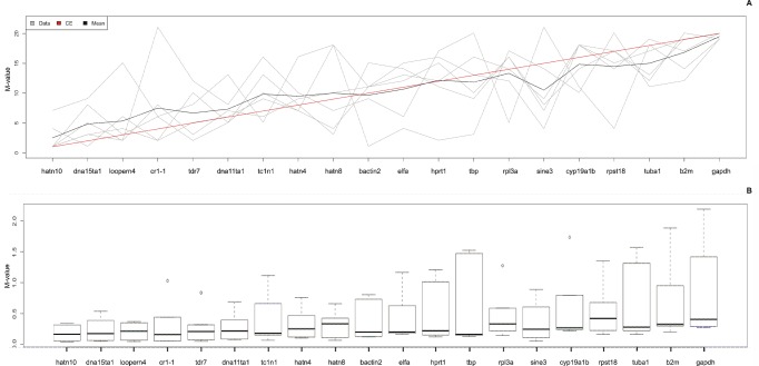
Figure 3. Rank aggregation analysis.
A: Rank aggregation analysis ordering the reference genes, based on their rank position according to each stability measurement (grey lines), from the most stable (left) to the least stable (right). Mean rank position of each gene is shown in black, as well the model computed by the Monte Carlo algorithm (red line). All EREs, except for sine3, are ranked better than the commonly used reference genes. B: Box plot representation of dispersion of the M-value. Boxes depict first and third quartile and the median is indicated with a line in the middle of the box, outliers are drawn as circles. Reference targets are ranked according to rank aggregation outcome (most stable reference targets on the left).

