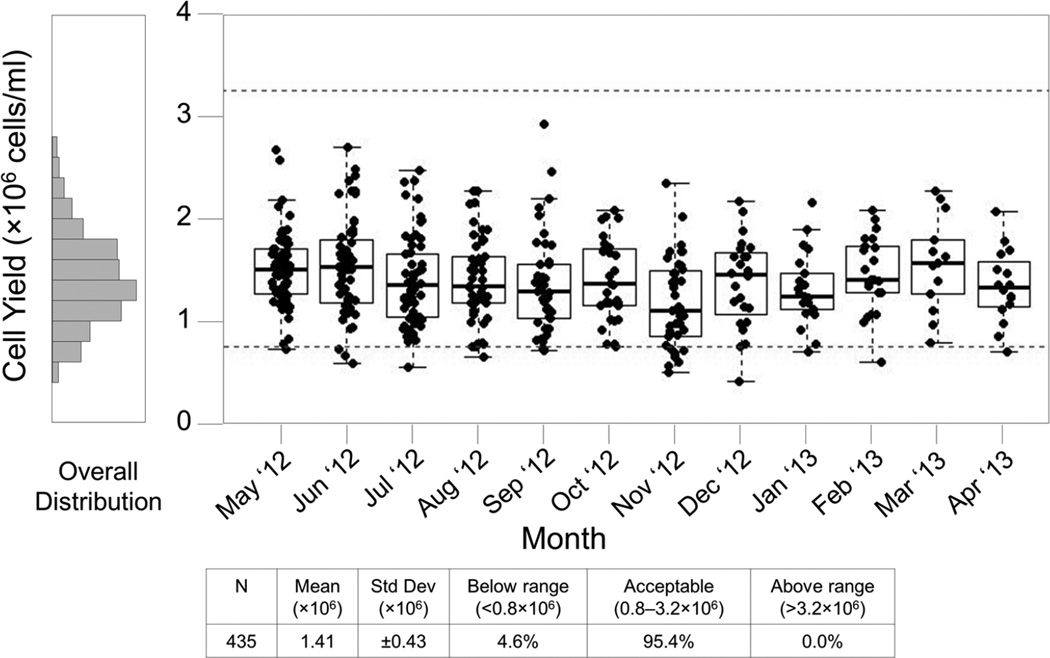
Figure 3. Site #10, 12 month Fresh Cell Yield Report for all technicians.
This report includes specimens processed May 2012 through April 2013. Each box plot represents the cell yield data from a single month for SPL #10. Boxes represent the 25 and 75 percentile, whiskers extend to the most extreme data point within 1.5 interquartile ranges (IQR) and the horizontal line in the box indicates the median cell yield for the month. Dotted lines indicate the expected range of 0.8 – 3.2×10⁶ cells/ml of usable whole blood.

