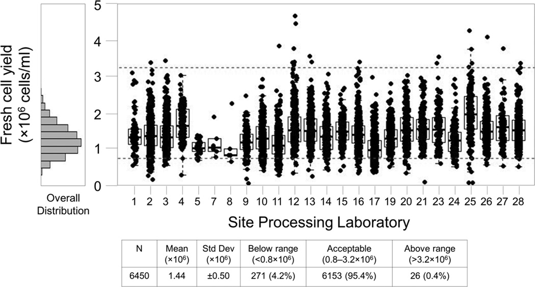
Figure 6. All Sites, 1 Year PBMC Fresh Cell Yield Report.
This report includes specimens processed September 2012 through August 2013. Each box plot represents the cell yield data from a single site for this period. Boxes represent the 25 and 75 percentile, whiskers extend to the most extreme data point within 1.5 interquartile ranges (IQR) and the horizontal line in the box indicates the median cell yield for the month. Dotted lines indicate the expected range of 0.8 – 3.2×10⁶ cells/ml of usable whole blood. The histogram at left shows the overall distribution of cell yields for all sites during this period. Three sites (#6, #18, and #22) are not shown because they did not process specimens for the HVTN during this period.

