
Figure 4.
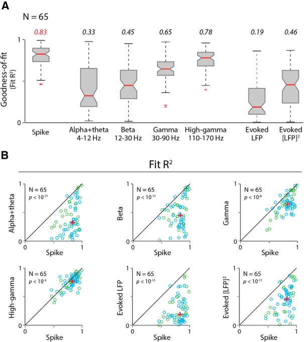
Population comparisons of goodness of fit (R2) show that imaging is consistently better predicted by spikes than by any LFP measure. A, Box plots showing population distributions of R2 (N = 65 experiments, two monkeys) for fitting imaging to spikes and to each LFP measure in turn, as labeled. Median R2 values are represented by horizontal red bars (values are also listed above). The bottom and top edges of each box represent the 25th and 75th percentiles, respectively. Whiskers extend to the most extreme data point not considered to be an outlier. Outliers (red crosses) are data points that exceed 1.5 times the first to third quartile distance either below or above. Nonoverlapping notches indicate that medians differ at the 5% level (a conservative estimate based on the assumption that measurements were independently acquired). Note that the notches for spiking only overlap with those for high-gamma LFP, indicating the superiority of spiking over other LFP measures even with this conservative assumption. Since our signals were acquired simultaneously (i.e., not independently), we were able to perform pairwise comparisons, experiment by experiment. B, Pairwise comparisons of R2 values for each LFP regressor, as labeled (y-axes), against corresponding spike-fitted R2 values (x-axes). Note that the spike-fitted R2 value is consistently higher than R2 values for fits to any LFP measure tested, including high-gamma band. Diagonals represent the equality line, and red crosses indicate medians; p values (Wilcoxon signed rank test, depicted at the top left of each scatter plot) estimate the probability that the pair of datasets comes from the same distribution. Data are shown color coded by monkey: blue for Monkey S (N = 40 experiments); and green for Monkey T (N = 25 experiments).