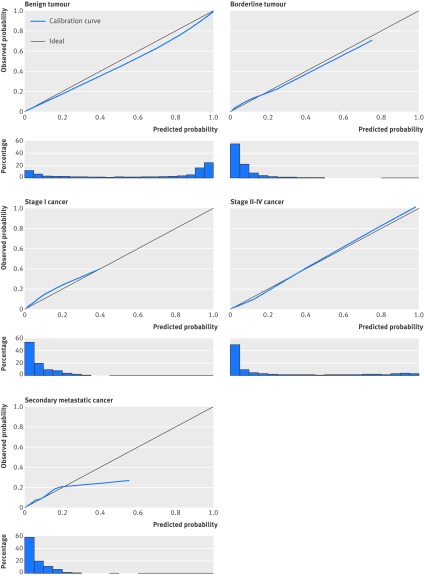
Fig 1 Calibration plots of predicted probabilities for each type of tumour. Data have been calculated using validation data (n=2403). Plots show how well the predicted probabilities (x axis) agree with observed probabilities (y axis). For perfect agreement, the calibration curve falls on the ideal diagonal line. Histograms below plots show distribution of predicted probabilities

An official website of the United States government
Here's how you know
Official websites use .gov
A
.gov website belongs to an official
government organization in the United States.
Secure .gov websites use HTTPS
A lock (
) or https:// means you've safely
connected to the .gov website. Share sensitive
information only on official, secure websites.
