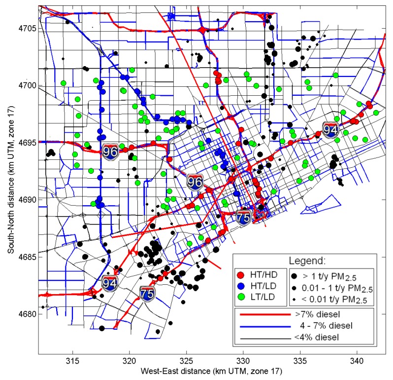
Figure 1.
Modeling domain for the NEXUS study. Major highways are shown as red and blue lines (for >7% diesel and 4%–7% diesel fraction) and other roads–as black lines. Model receptors are shown in red, blue and green circles for the HD, LD and LT traffic exposure group, respectively. Stationary sources are shown as black dots (symbol size indicates the magnitude of PM2.5 annual emissions).

