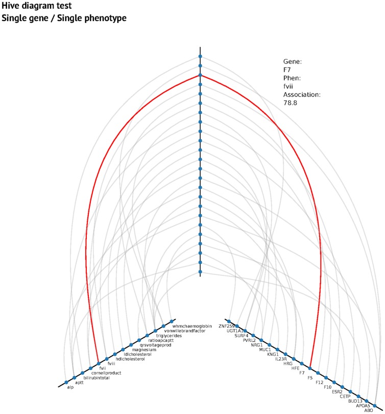
Figure 1. Hive plot for single gene/single phenotype.
The vertical axis represents the association value (higher, more association). The left axis represents phenotypes and the right axis represents genes. An interactive hive plot is published on the project webpage (http://pleioexp.epi.bris.ac.uk/cca/1gene1phenhive.html).

