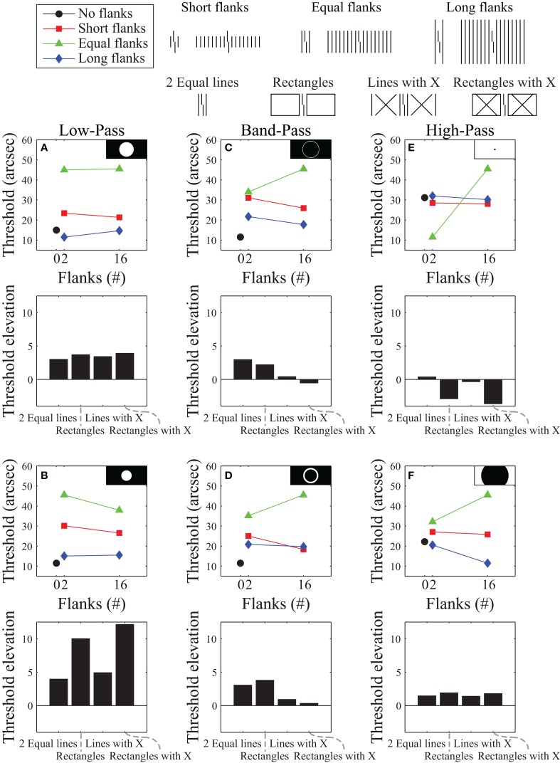
Figure 3.
Simulation results using a Fourier model for the stimuli that produced the data presented in Figure 2. Model results are plotted for representative low-pass filters (A,B), band-pass filters (C,D), and high-pass filters (E,F). Black and white insets show which frequencies were passed (white areas) and which frequencies were suppressed (black areas) in Fourier space (with lower frequencies in the center and higher frequencies near the edges). The top row of subplots shows the best performance obtainable (using brute-force exhaustive search for the smallest sum of squared residuals against the human data) with each filter type. The bottom row shows results for filtering functions selected from different parts of the space - illustrating the variability of results obtainable with each filter type. The best overall performance we could obtain with this model is shown in (C).

