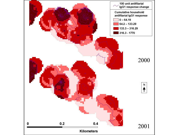
Figure 6.
Smoothed household antifilarial IgG1 response for 2000 (top) and 2001 (bottom) for the third boxed section of the community as identified in Figure 5. The purple lines represent change in total antifilarial IgG1 response by 100 units. The colored zones represent the total household antifilarial IgG1 level in the area of the community. The darker the red area the higher the total household antifilarial IgG1 level.

