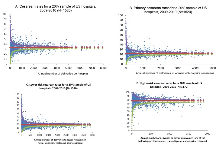
Figure 1. Funnel plots of hospital cesarean rates, overall and for subgroups of women.
Funnel plots show how each individual institution (blue dot) performs compared to the mean (red) and control limits (the 99% prediction interval around the calculated mean). The upper control limit is shown as purple and the lower control limit is shown as green. Cesarean rates for (A) all women, (B) women with no prior cesarean, (C) lower risk women, and (D) higher risk women.

