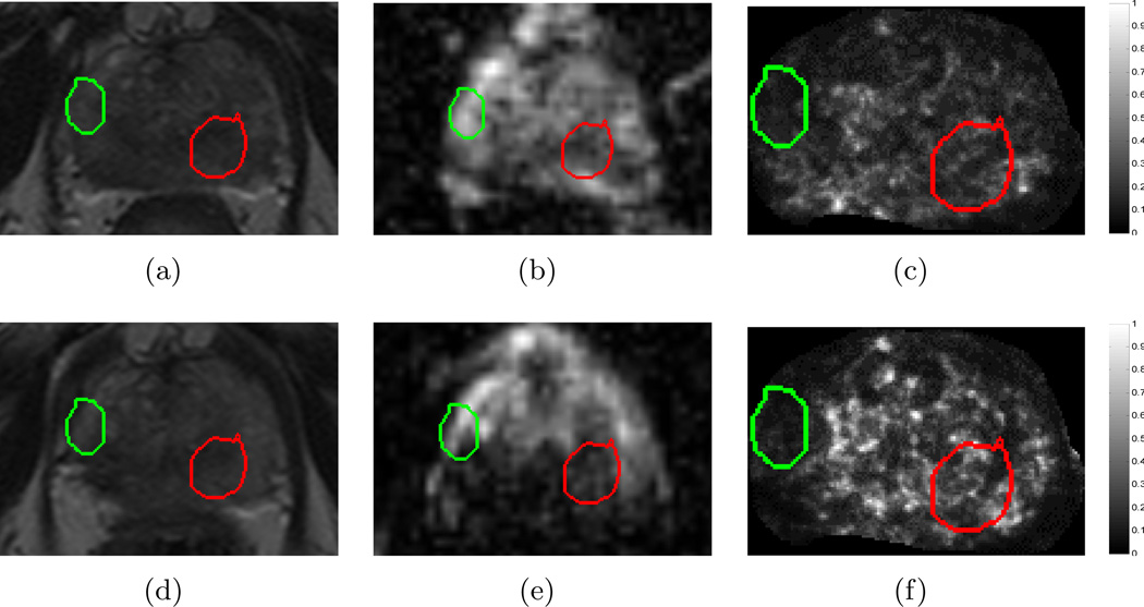
Figure 6.
Images from a single dataset corresponding to representative sections from (a) , (d) , (b) , (e) , (c) , (f) . Green outlines correspond to benign regions (N(C)) while red outlines correspond to cancerous regions (A(C)), as annotated by a radiologist. While little change is observed within the CaP region (red) between (a) and (d) on T2w MRI, corresponding ADC value appears to change distinctly between (b) and (e). By contrast, an empirically chosen T2w feature (Haralick energy) illustrates distinct change within the CaP region (red), low change within benign region (green), as well as a reaction to LITT adjacent to A(C), depicted via brighter values around the red outline (compare (c) and (f)).

