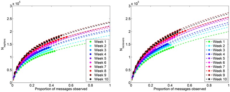
Figure 5. Number of nodes in Twitter reply subnetworks.
(Left) The quantity N repliers is shown for Weeks 1 to 10, where each data point (dot) represents the average over 100 simulated subsampling experiments. The dashed line represents the best fitting model of the form N repliers = axb to the observed data. We extrapolate this model to predict N repliers. (Right) The same as panel, except for N receivers.

