
Fig. 4.
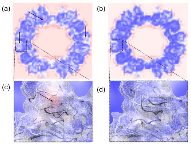
Planar VolumeSlice representation of spatial cross correlation maps for the (a) first and (b) last frames of an MDFF simulation of the rabbit hemorrhhagic disease virus capsid. These maps visualize local cross correlation of 8×8×8 voxel regions, with red indicating poorest correlation and dark blue indicating best correlation. Regions of poorest correlation lie on the exterior and interior faces of the capsid, as would be expected. Poor-fitting regions within the subunits of the structure are seen as red spots and are marked with arrows. Panels (c) and (d) show closer views of one of these poor-fitting regions, before and after fitting, respectively. The structure is shown inside the experimental density map and is colored according to the corresponding spatial cross correlation volume around that region, to further visualize which parts of the structure have a poor fit. Panel (c) clearly shows a poorly fit region, with parts of the structure entirely outside of the density, which has been fixed by MDFF as evident in (d).