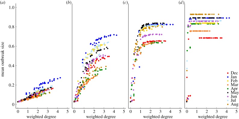
Figure 2.
Mean outbreak size increases with the weighted degree centrality of the index case. Mean outbreak sizes are shown (as proportions of the community) against weighted degree centrality of the index case for proximity networks. Panels show different levels of pathogen infectiousness ( = (a) 0.7, (b) 1.5, (c) 3.0 and (d) 10.0), and data point colours represent different monthly networks. Thus, there are 37 data points (representing each possible index case) for each month within a given value of
  . Estrous females were present during Jan (n = 1 estrous female), Apr (n = 1), May (n = 1), Jun (n = 1), Jul (n = 2) and Aug (n = 2).

