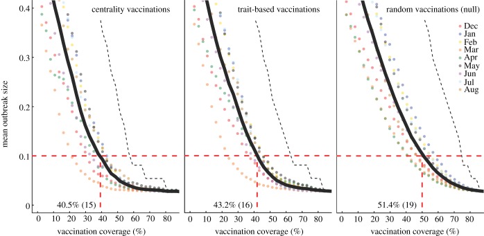
Figure 4.
Evaluation of vaccination strategies by minimum coverage threshold. Mean outbreak sizes (as proportions of the community) are shown for varying levels of vaccination coverage (as percentages of the community) when  . Coloured dots show mean outbreak size by month, and thick black lines show mean outbreak size averaged across months. Red dotted lines indicate the minimum coverage threshold (with the number of chimpanzees in parentheses) required to constrain outbreaks to less than 10% of the community. Black dotted lines show upper 95% CIs, which are equivalent to the conservative coverage thresholds depicted in figure 5. For all coverage levels and vaccination strategies, the lower 5% of simulations had a mean outbreak size of 2.7%, indicating that only the index case was infected.

