
Figure 4.
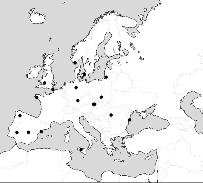
Data from Wicken Fen (gray circle) were compared to data from reed warbler populations across Europe (black circles). Details of these studies are given in Table S3. Map adapted from http://neethis.deviantart.com.
Official websites use .gov
A
.gov website belongs to an official
government organization in the United States.
Secure .gov websites use HTTPS
A lock (
) or https:// means you've safely
connected to the .gov website. Share sensitive
information only on official, secure websites.
Data from Wicken Fen (gray circle) were compared to data from reed warbler populations across Europe (black circles). Details of these studies are given in Table S3. Map adapted from http://neethis.deviantart.com.