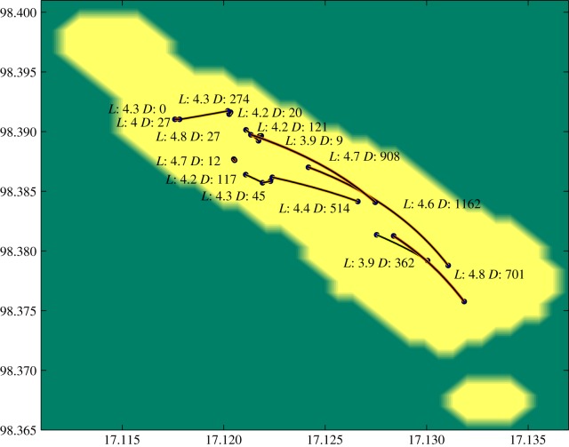
Figure 6.
The pairs of households between whom the model average of the predicted number of transmission events was among the 15 closest ranked. The yellow area corresponds to the populated area in the refugee camp, and the points correspond to households, connected by lines presenting possible transmission. Near each line we show the posterior mean for the predicted transmission links (L), together with the distance between the corresponding households in metres (D). The pairs with highest proximity to each other are the least visible in the figure.

