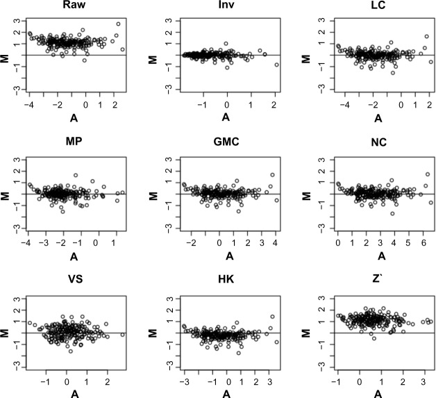
Figure 4.
MA-plots for a typical pair of control samples from the raw data and the data normalized with various methods. A = (X1 + X2)/2 and M = X1 − X2, where X1 and X2 denote the protein concentration values of the two samples in log2. The control samples are cell lines printed on every slide mainly for quality control, and each unique cell line has at least two replicates per slide. Plotting any other pairs of control samples also gave similar patterns that support our conclusion that the Inv method performs best.

