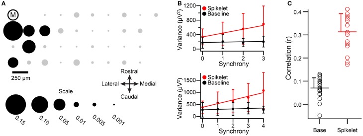
Figure 5.
Relationship between spikelet-related variance and CS synchrony holds under urethane anesthesia. (A) Bubble plot representing the synchrony distribution with respect to cell M. The relative positions of the recorded PCs in the array are indicated by circles, and the encircled “M.” The areas of the circles are proportional to the synchrony between CSs of cell M and the other PCs in the array. Note that cell M's activity is strongly correlated mainly with neighboring cells. Black circles along with cell M comprise the cell group that was analyzed. (B) Plots of average variances during the CSs and the baseline periods as a function of CS synchrony among group members. Top graph is for cell M. Bottom graph is for another group member (indicated by black circle in third row, second column of the array). Regression lines are fits to the entire set of CSs for each cell, not the average points that are plotted. Error bars are one SD. Synchrony defined using a 5 ms bin. (C) Distribution of correlation values for the relationship between synchrony and variance for spikelet-related and baseline periods. Circles indicate individual cell r values, horizontal lines show distribution means, and error bars indicate the SD.

