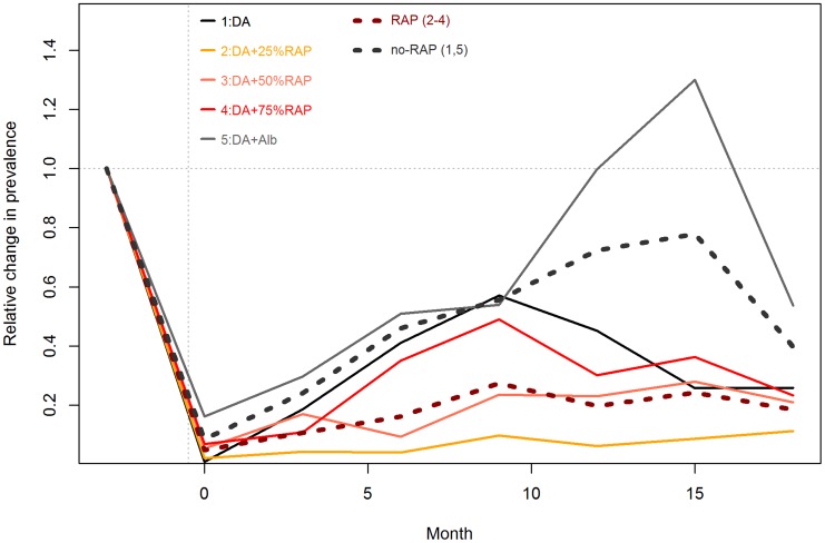
Figure 3. Relative Change in trypanosome prevalence by Regimen 1–5.
Lines represent the relative changes from the baseline prevalences, presented are the means from the 4 village estimates. The dotted lines represent average prevalence in RAP (2–9; brown) and non- RAP (1&5; black) regimens respectively.

