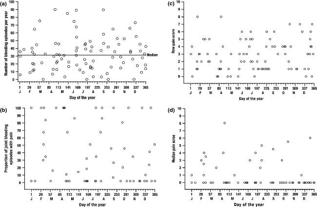
Figure 3.
(a) Distribution of annualized bleeding events in each on-demand treatment period per patient, by day of the year. Data from both on-demand periods were pooled so that all months could be represented. Each circle represents up to two data values for an individual patient. The time point represents the midpoint of the patient's participation in that period. (b) Proportion of joint bleeding episodes associated with pain per patient in each on-demand treatment period, by day of the year. Each circle represents the proportion of joint bleeding episodes for which the patient answered ‘Yes’ to question 1 on the BPI (‘Have you experienced significant pain today?’), plotted at the midpoint of the patient's participation in that period. (c) Raw pain scores for patients reporting pain from a joint bleeding episode during either on-demand period, by day and year of occurrence, for each reported episode. Each circle represents a raw pain score, which is plotted on the day of occurrence. (d) Median pain score in each on-demand treatment period per patient, by day of the year. Each point represents the median pain score for each patient, plotted at the midpoint of the patient's participation in that period. A pain score of 0 was imputed for any joint bleeding episode for which a patient reported no significant pain.

