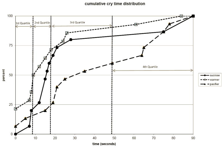
Figure 1. Cumulative Distribution Graph of Cry Times.
Graph represents the cumulative distribution of infants for the amount of time spent crying after vaccination. The quartile distribution cutoffs are indicated with vertical dotted lines. At each crying time there is a consistently higher percentage of warmer infants after vaccination compared to the other groups (p<0.05).

