
Figure 3.
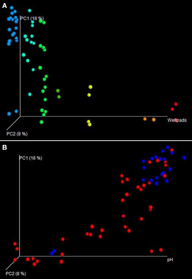
Directional Principal Coordinates Analysis (PCoA) plots were used to visualize differences in weighted UniFrac distances of MSA+ and MSA− samples. (A) Samples were plotted according to number of wellpads along the horizontal axis of the directional PCoA plot. Samples with no wellpads are colored in blue, whereas samples with the highest wellpad count are colored red. Distinct clustering can be observed between samples with a high number of wellpads and samples with a low number of wellpads. A majority of samples with a low wellpad count cluster at the top of the PC1 axis, a region where no samples with a high wellpad count are observed. (B) When imposing pH to the horizontal axis, distinct clustering between MSA+ (red) and MSA− (blue) is observed, implying pH in conjunction with impact status shapes microbial community structure.