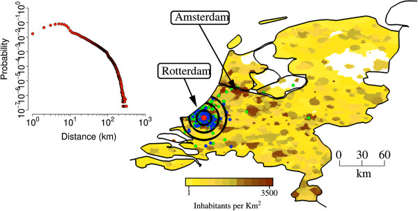
Figure 2.

Study area. The map shows population density of the Netherlands (colors from yellow to dark brown indicate increasing densities, from 1 to 3,500 inhabitants per km2), the location of the laboratory in a randomly chosen simulation (in Rotterdam, red point), the location of the workers houses (blue points), the location of workplaces and schools attended by household members of laboratory workers (green). Black concentric circles indicate distances of 10 km, 20 km, 30 km from the laboratory. The inset shows the probability of commuting to (at) a certain distance by laboratory workers.
