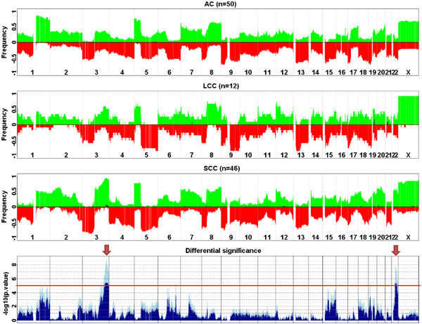
Figure 2.

Differential genomic regions for AC vs LCC vs SCC populations aCGH profiles. The three upper panels display the average profiles of AC, LCC and SCC subpopulations as their respective frequencies of gains (green, from 0 to 100%) and losses (red, from 0 to −100%) along the human genome. Darker green bars correspond to the frequencies of amplifications, defined as regions with a log2 (ratio) above 1.0. The lowest panel shows the significance of the ANOVA tests displaying the minus log10-transformed raw (lighter blue) and BH-adjusted (darker blue) p-values. The horizontal red line corresponds to a BH-adjusted p-value < 1.0E-05. Arrows point to the two most significant differential regions: 3q26.2-3q29 and 22q12.1-22q13.1.
