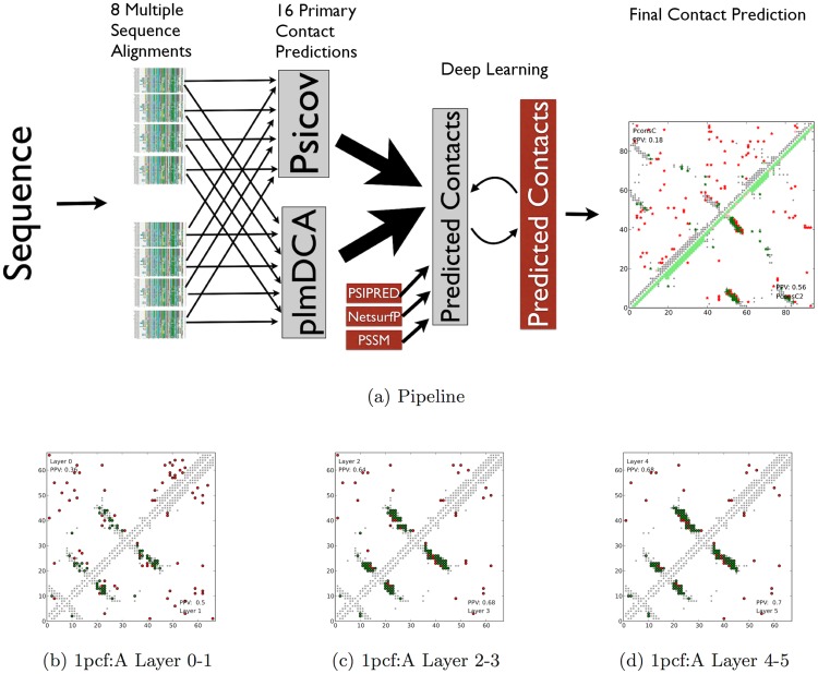
Figure 2. a) Overview of the PconsC and PconsC2 pipelines.
For a query sequence; HHblits and jackhmmer are used to produce in total 8 multiple sequence alignments. In total 16 different contact maps are then produced using PSICOV and plmDCA. These are then fed into two different machine learning protocols, PconsC and PconsC2. In PconsC2 additional features are added and five layers of deep learning is applied. Predictions from PconsC and PconsC2 are shown to the right. b–d) An example on how the deep learning procedure used in PconsC2 improves predictions for the protein 1pcf:A. Each upper or lower triangle depicts the top L long-range predictions in a contact map predicted at one layer. Green dots represent correct predictions and red wrong predictions, while grey depicts true contacts. The values in the corners of the contact maps represent the fraction of correctly predicted contacts (PPV) within the top L long-range predictions. In this example the number of correct predictions doubles from the first to the last layer.

