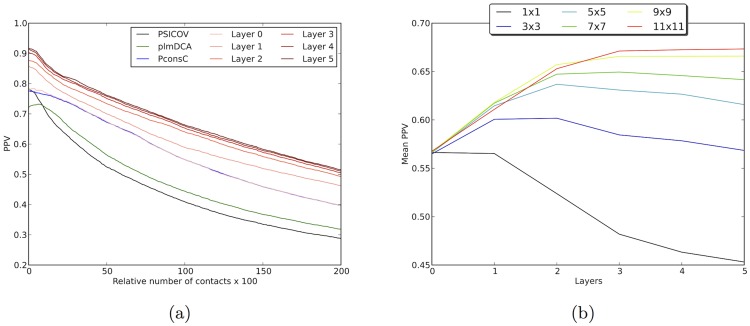
Figure 3. a) ROC plot depicting the PPV values for different predictors.
The x-axis represents the number of contact predictions in relationship to the length of the protein. At  one prediction is included for each residue in each protein. The baselines are predictions from PSICOV (black), plmDCA (green) and PconsC (blue). Predictions from different layers in the deep learning procedure during training of PconsC2 are shown in red. The prediction at the first layer overlaps almost perfectly with prediction from PconsC. b) Impact of different sizes of the receptive field on prediction precision, measured at
  contacts. The X-axis represents each layer in the deep learning procedure.

