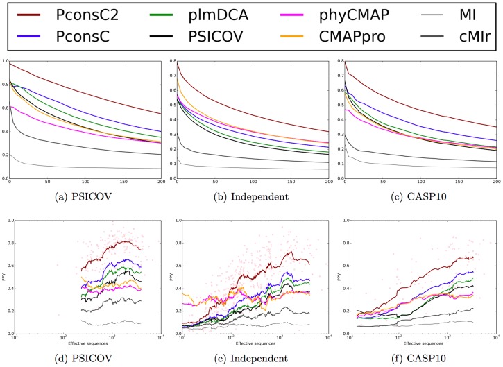
Figure 6. (a–c) ROC plot depicting the PPV values for different predictors.
The x-axis represents the number of contacts prediction in relationship to the length of the protein. At L = 1 on average one prediction is included for each residue in a protein. (a) Performance on the PSICOV set, (b) Performance on the new dataset, (c) Performance on the CASP10 dataset. (d–f) Positive predictive value plotted versus efficient number of sequences for predictions considering top  contacts per protein. The lines show a running average and the red dots individual predictions by PconsC2.

