
FIGURE 4.
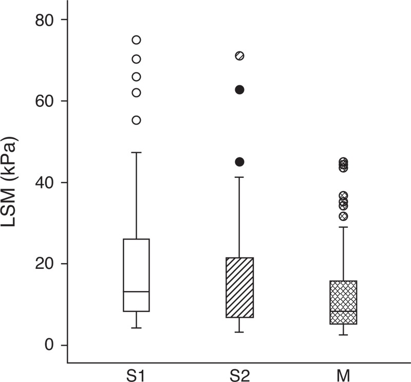
Box-and-whisker plot of LSM showing distributions of LSM according to the probe. The box represents the interquartile range, and the line in the box shows the median value. The whiskers indicate the highest and lowest values, and the circles represent outliers. LSM = liver stiffness measurement.