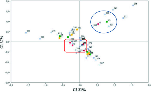
Figure 2.

Correspondence analyses of overall LH-PCR profiles. LH-PCR data statistically analysed by correspondence analyses (CA). The two axes represent the percent variation in species. Two different clusters were present in CA diagram. Healthy and diseased grapevine plants sampled in June, both coordinates positive grouped at the right of the diagram (graphically represented inside the blue circle); results of diseased plants sampled from July to October clustered around the centre of the axis (graphically represented inside the red square). Healthy, recovered and diseased grapevine plants collected from June to October are represented by green, yellow and red dots, respectively. S = healthy plants; I = diseased plants; R = recovered plants; G = June; L = July; A = August; S = September; O = October. Within the graphics, numbers represent the peak size.
