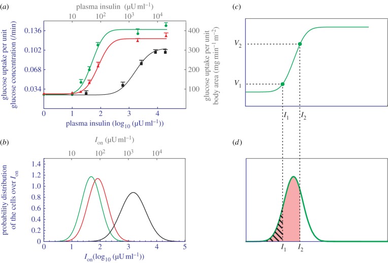
Figure 3.
Analysis of data obtained from insulin clamp experiments. (a) Dose–response relationship between the plasma insulin concentration and the whole-body's rate of glucose uptake in normal (green circles), obese non-diabetes (red triangles) and obese diabetes subjects (black squares). The curves are obtained by using the electronic supplementary material, equation S7, to fit with the data. Two setting of units are used: one from the original data (grey) and the other from the simulation (blue). (b) The Gaussian distribution of cells over their Ion values. The green, red and black colours correspond to normal subjects, obesity non-diabetes and obese diabetes, respectively. (c) A reproduction of the normal subjects' dose–response curve, with only two data points presented. (d) A reproduction of the normal subjects' cell distribution. The hatched area corresponds to V1 and the pink area corresponds to V2.

