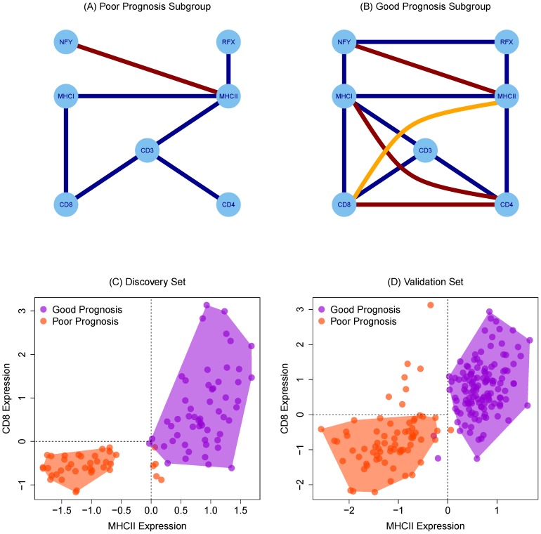
Figure 3. Partial correlation graphs indicating conditional relationships between genes in poor prognosis (n = 39)(A) and good prognosis (n = 55)(B) subgroups.
Blue edges are positive associations and red are inhibitory associations. The highlighted orange edge can be removed by considering an independent set of genes. CD8 and MHCII array expression separate good and poor prognosis subgroups in discovery (C) and validation (D) data sets. MHCII expression is positively prognostic but appears in CD8 expressing samples. Shading is added for emphasis.

