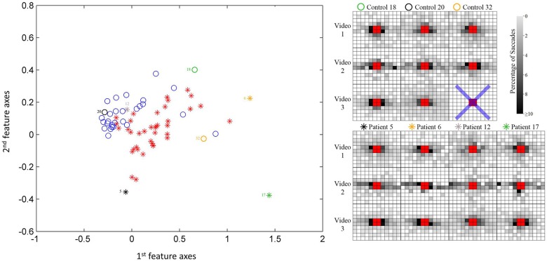
Figure 4.
Scatterplot of participant data on the first two most significant feature axes from the KPCA; this provides a visualization only of the reasonable separation between patients and controls. Note the classifier is blind to the diagnosis. Example saccade maps (right) from three controls and four patients for all three videos in this study. The blue cross represents a trial that does not have enough valid eye movement data according to the filtering process. The symbols correspond to the location of the subject in the scatterplot.

