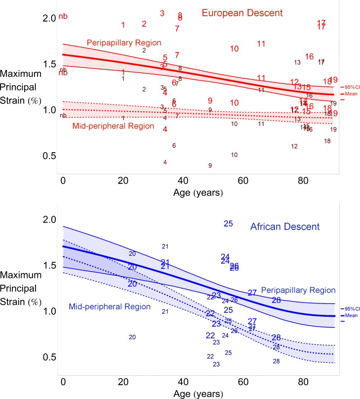
Figure 2.
Regional changes in maximum principal strain with age within racial groups. Scatterplots indicate the computed average strain values for the peripapillary (bigger font size) and midperipheral (smaller font size) paired by donor number. The thick lines denote the mean statistical estimate for each region and the thin lines denote the 95% point-wise CI of the estimated nonlinear regression line (not the data) in the ED group (red, upper) and AD group (blue, lower). Strain data from the newborn donor (nb) in the ED group were included in the upper plot, but not in the statistical analysis used to estimate the plotted curves, to provide a qualitative comparison of the statistical estimate a lower ages. Each regression plot shows the 95% CI of the curve representing the maximum principal strain variation with age for each region. In other words, the shaded regions show the 95% probability bound for the regression curve of the population.

