
Figure 1. Three slides presented to respondents to discuss the visual design of the mental health care disparities report cards.
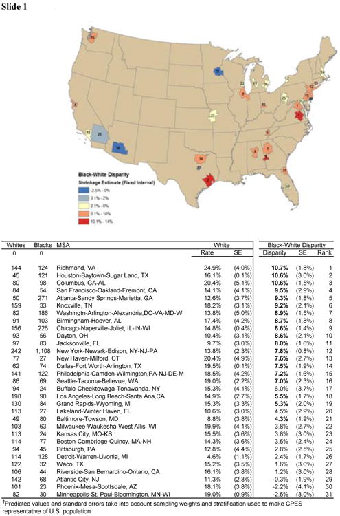


Slide 1: Map for 31 Metropolitan Statistical Areas (MSAs) ranked and colored by magnitude of black-white disparity in rates of any mental health care
Slide 2: Scatter plot of percentage white mental health care use (x-axis) and minority percentage minority mental health care use (y-axis)
Note: These figures show the relationships between minority mental health use and white mental health use. Dots are shaded by percent minority living in each MSA. If national disparities were solely due to minorities living more in cities that utilize mental health care less, then all dots would fall on the 45 degree line and darker shaded dots would be towards the bottom left. Most of the points lie below the line, indicating that disparities exist for all racial/ethnic groups most MSAs. Darker shaded dots are located in the bottom left, indicating that location contributes to overall disparity, but most dots fall below the line, indicating that there are also disparities within MSAs.
Slide 3: Ranking with confidence intervals of disparities in any mental health care use
Note: Estimated disparities and 95% intervals based on model-generated predictions from Collaborative Psychiatric Epidemiology Surveyes. The black line is at 0, the red line is the average across all MSA estimates. Most MSAs have disparities significantly <0. Except at the extremes, disparities within MSAs are not significantly different.