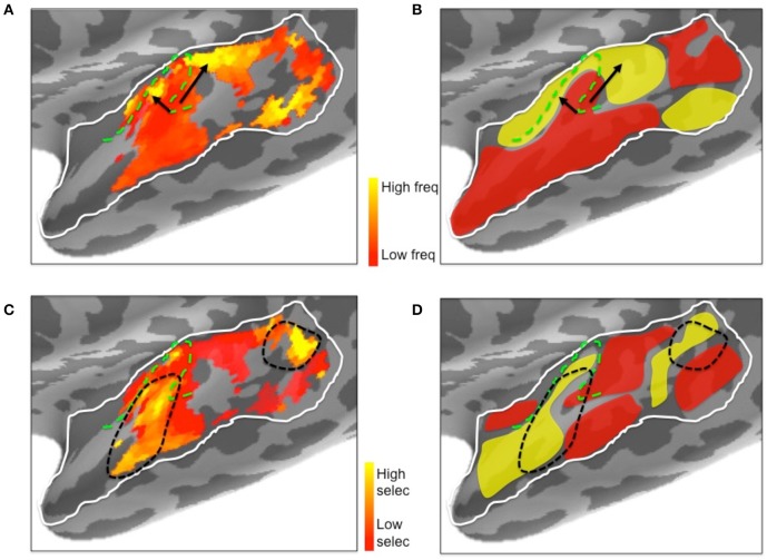
Figure 10.
Illustrative comparison of the ssRSA/EMEG results (A,C) with existing left hemisphere tonotopic maps based on fMRI techniques (B,D). (A) Frequency preferences mapped from EMEG and (B) from fMRI. Black arrows indicate the directions of suggested low to high frequency gradients in V-shaped orientation. (C) Frequency selectivity mapped from EMEG and (D) from fMRI. Black dashed lines indicate higher frequency selective regions in and near primary auditory cortex. The schematic fMRI-based diagrams (B,D) were generated based on information from Saenz and Langers (2014) and Moerel et al. (2014). Dashed green lines show the outlines of Heschl's gyrus.

