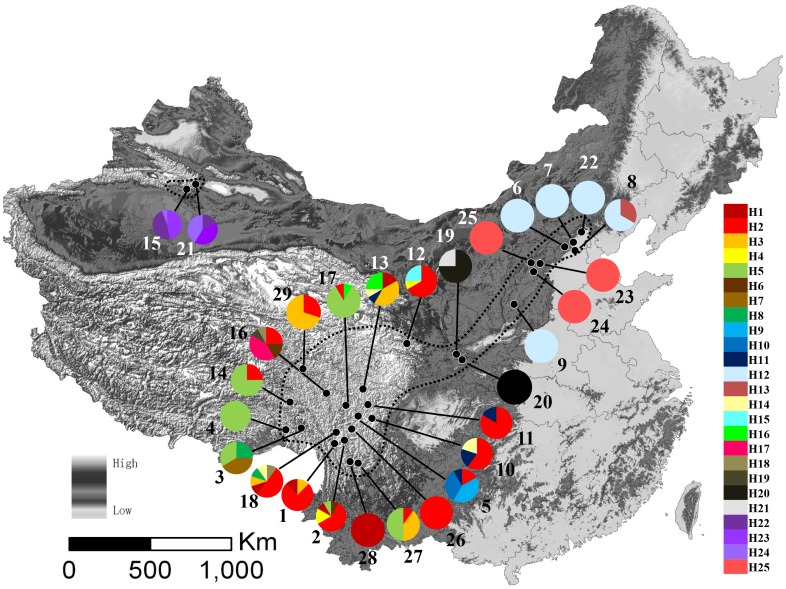
Figure 1. A map of the sampling sites and the geographic distribution of Rhodiola kirilowii haplotypes.
Pie charts show the proportion of chlorotypes within each population. The numbers beside the circles represent population numbers listed in Table S1. Dash line on the map indicate the distribution area of R. kirilowii.

