FIGURE 3:

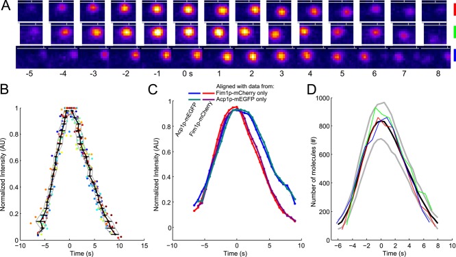
The time course of fimbrin and capping protein appearance and disappearance in endocytic patches is highly reproducible. (A) Example of three patches tracked with fimbrin (Fim1p-mEGFP) in wild-type cells (1 patch per line with the color code for each patch on the right). Each image represents the sum of Fim1p-mEGFP fluorescence intensities from five confocal sections at 1-s intervals. The horizontal gray lines represent the approximate position of the plasma membrane, and the vertical gray ticks mark the horizontal positions of each patch in the first image. Fim1p-mEGFP fluorescence intensity is color-coded from low to high intensities: black–blue–orange–red–yellow–white (ImageJ “fire” lookup table). Colored scale bars: 500 nm. (B) The variability in timing between patches is less than the measurement interval. Time course of the fluorescence of fimbrin-mEGFP in 24 patches matched by continuous alignment and normalized to their peak values. Each dot corresponds to a time point of a given track. Each color corresponds to a different track. The black curve is the average time for the normalized fluorescence to reach a given value. The horizontal black lines are the SDs of these mean times and are plotted in Figure S3A. The gray curves represent the average ± 1 SD. (C) Average of two-color data sets realigned using the data from only one channel. Blue, Acp1p-mEGFP, and red, Fim1p-mCherry: realigned using only Fim1p-mCherry data; teal, Acp1p-mEGFP, and purple, Fim1p-mCherry: realigned using only Acp1p-mEGFP data. The raw data used for this alignment are the same as for Figure S1K in Berro and Pollard (2014); N = 19. (D) Numbers of fimbrin molecules in 3 endocytic patches from A vs. time. These and 21 other data sets were aligned on the same timescale by temporal superresolution alignment of the intensities to calculate the averaged numbers over time (black curve) ± 1 SD from the average (gray curves). Time zero is the time when the average number of fimbrin molecules peaked.
