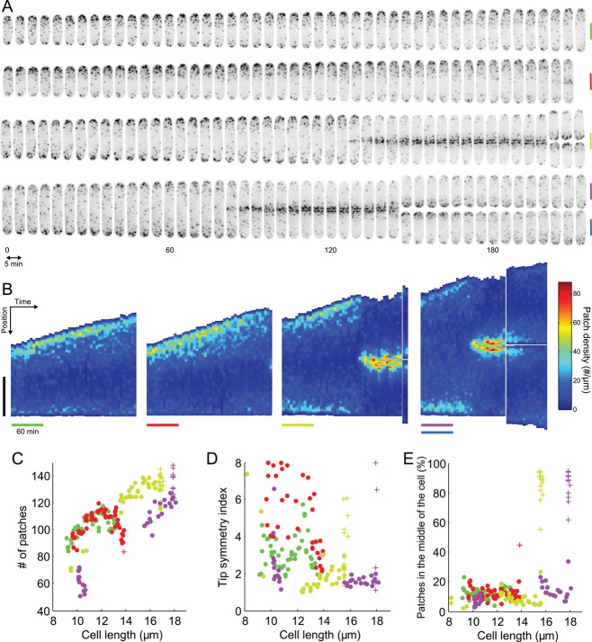
FIGURE 8:
Evolution of patch distribution over time in individual living cells. (A) Montage of four different cells expressing Fim1p-mEGFP (inverted contrast) over 215 min, imaged every 5 min. Vertical bars are 5 μm, colored to identify these cells in the other panels. Micrographs are sum projections of 18 consecutive z-slices spaced by 360 nm. (B) Kymographs of the temporal evolution of the patch density along the lengths of the four cells in A. In each subpanel, each vertical strip corresponds to the density of patches along the long axis of the cell at a given time point. The densities are color coded from dark blue for the regions of the cell with the lowest density of patches to dark red for the regions with highest densities of patches. Vertical black bar: 5 μm. Colored horizontal bars: 60 min. (C–E) Changes in the distributions of patches in cells in A over time using their lengths as a proxy for time. (C) Evolution of the number of patches over time with each point corresponding to one image from A. (D) Evolution of tip symmetry with time. (E) Evolution of the proportion of patches in the middle of the cell with time. Points, cells in interphase; crosses, cells in mitosis. The bars in B and the dots and crosses in C, D, and E have the color assigned in A.

