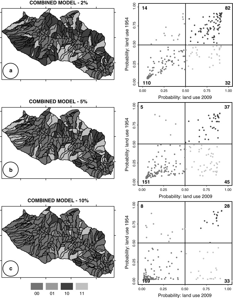
Fig. 5.

pp-plots and maps show for each slope unit of the CM models (Fig. 4), the difference between the probability values obtained using the 2009 and the 1954 land use maps. In the pp-plots, dark green and dark pink points represent SU classified as stable or unstable in both models whether light green and light pink points SU with different classification. Numbers in the pp-plots show the count of points (Color figure online)
