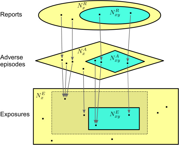
Figure 1.

Inter-component relations in our linking model between individual case reporting and the real world. Note: All variables in the figure denote the numbers of elements of their respective sets, not the names of the sets themselves. Here, let the drug of interest X be ’analgesic’, and the adverse event of interest Y be gastrointestinal haemorrhage. The ellipses at the top represent the database of individual case reports: let , the total number of reports on ’analgesic’, be 16,000, and assume that 400 of those reports concern gastrointestinal haemorrhage, i.e. . Thus, the reporting ratio for gastrointestinal haemorrhage with ’analgesic’ is ρxy = 400/16,000 = 2.5%. Further, shapes with edges correspond to the real world: The rectangles represent the universe of exposures to ’analgesic’, and the diamonds represent the universe of adverse episodes that have followed those exposures. In this example, the total number of adverse episodes is 800,000, of which 5,000 contain gastrointestinal haemorrhage, i.e. . Each report maps to a single adverse episode, and each adverse episode is reported at most once: here the general reporting coverage for ’analgesic’ is . The reporting coverage specifically for gastrointestinal haemorrhage with ’analgesic’ is . Those exposures that are followed by adverse episodes all reside within the dashed rectangle. Logically each of those exposures is mapped by at least one adverse episode, and each adverse episode maps to a unique exposure in the dashed rectangle. Of particluar interest are those exposures that are followed by at least one adverse episode containing gastrointestinal haemorrhage, i.e. the turquoise rectangle within the dashed rectangle. Here there are such exposures, out of ’analgesic’ exposures in total. Hence, the true risk is . All variables are described in Table 1.
