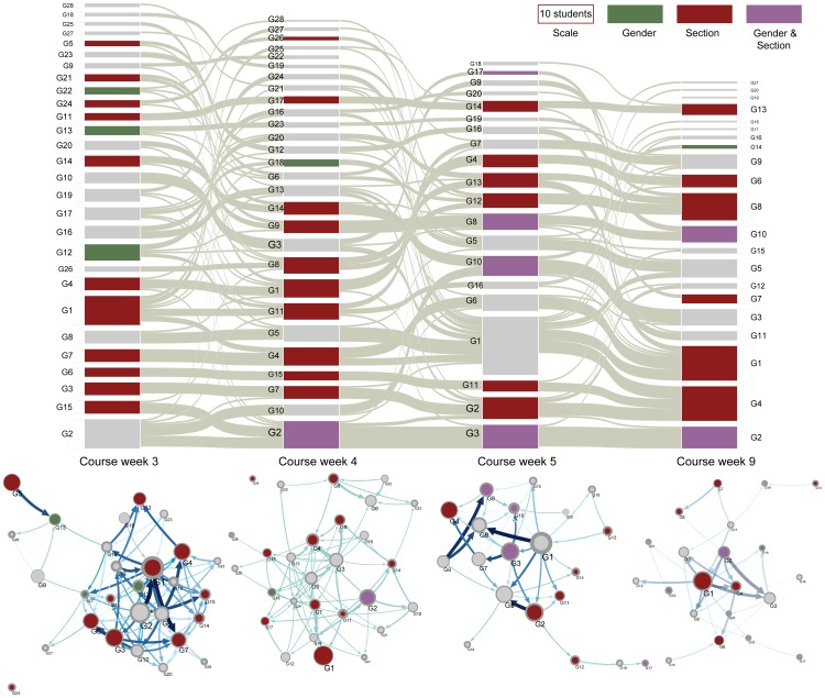
Figure 6. Large scale structures show between-week student movement and within-week information flow.
Top: Alluvial diagram for communities of the four networks displayed in Figure 2. The height of a block indicates the number of students in the community (see scale). The thicknesses of the gray streamlines between groups in different weeks indicate between group movements; thicker lines indicate that more students moved together. The color of a box representing a community indicates whether it is significantly segregated ( ) with respect to the given attribute. Bottom: Maps of community structure for the same networks. Node sizes are proportional to accumulated flow rate for a particular community. Labels on the map correspond to labels in the alluvial diagram, allowing for comparison between community size and flow. Arrow sizes are proportional to the information flow between groups as calculated by Infomap. Color codes in the maps have the same meaning as in the alluvial diagram. The total number of communities each week is 28, 28, 22, and 20, respectively.

