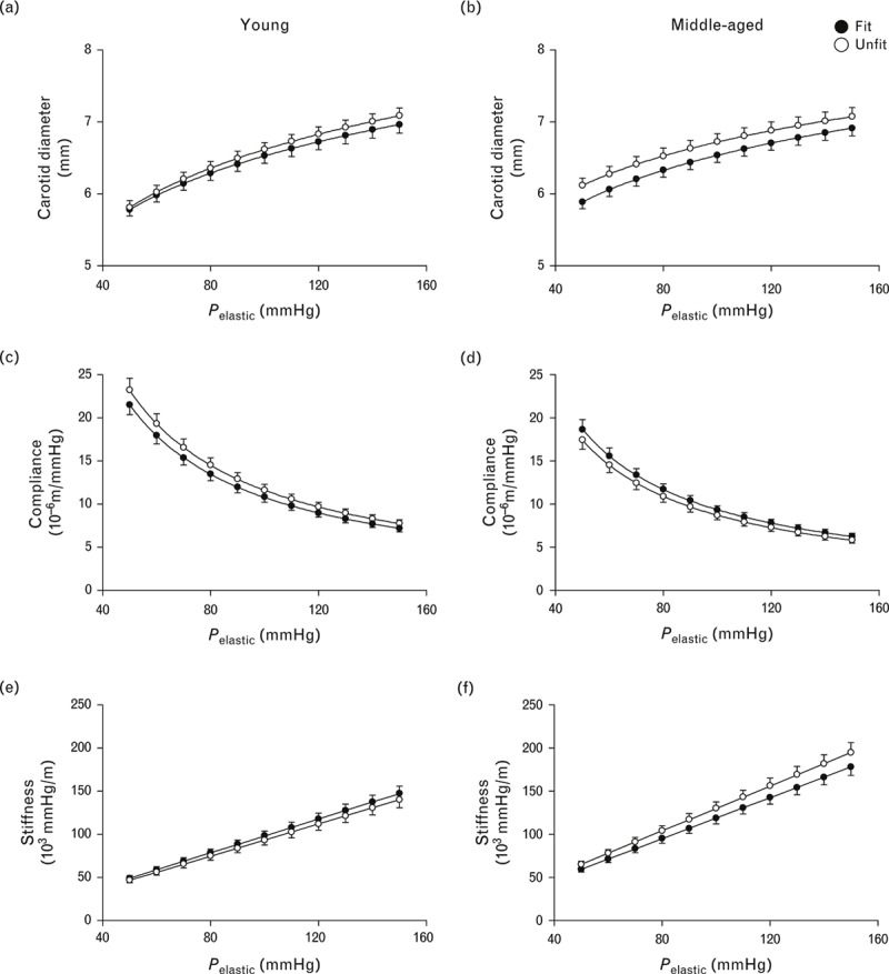
FIGURE 2.

Line graphs showing comparisons of diameter–pressure (a and b), compliance–pressure (c and d) and stiffness–pressure (e and f) curves over a pressure range from 50 to 150 mmHg between fit and unfit groups in young (left) and middle-aged men (right). These graphs were calculated using the values of alpha and beta in Table 3. Data are means ± SEM.
