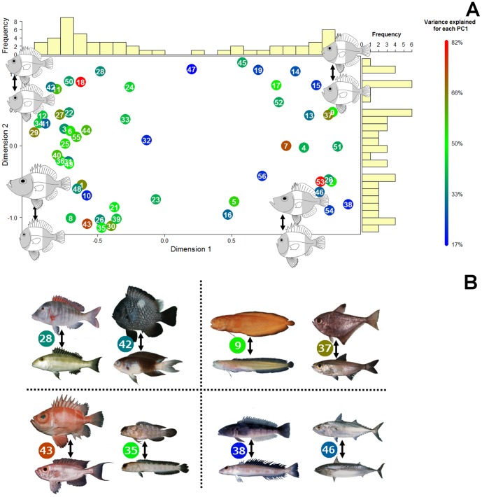
Figure 7. The two first axes of a principal coordinate analysis (PCoA) conducted on differences in orientation of the first PC for each of the 56 families with a representation of the deformation associated for each corners (A).
The first principal component of shape was extracted for each family (Fig. 2). Then, the pairwise angles among the different families PC1 were used as a metric to quantify similarities in shape change among families. Finally a principal coordinate analysis was used to visualize similarity among families in the primary axis of body shape change. Families that fall close together in this analysis express similar patterns of shape change on their family-specific PC1. Colors represent the variance explained by PC1 for each family and the numbers inside each symbol corresponds to the family names listed in Table 1. Barplots reveal a bimodal distribution of families on the first axis. Examples of family changes along their first PC are represented for the four corners (B). It is important to note that the position of the poorly sampled families may change if sample size increase (This concern families 4, 6, 7, 9, 15, 16, 17, 18, 20, 25, 35, 47, 49, 50, 52 and 56).

