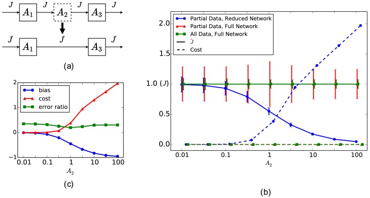
Figure 2. Metabolite removal in KFP.
(a) A schematic diagram of getting the reduced model through metabolite removal in KFP. Dashed squares represent metabolites removed in the reduced model; thick dark arrow represents reduction;  represents the estimated
  (potentially biased). (b) The estimation results for the three options. The solid curves represent
  , the dashed curves represent the cost of fitting (normalized by the number of data points to be comparable across options), and three colors represent the three options. Parameter values used for generating the simulated data:
  (overall patterns independent of the choice here). (c) The estimation results in (b) in terms of the three summary statistics.

